
Yama Experiences Marketplace
2020-2022

"Yama is a dual-sided marketplace that connects users to local guides offering unique experiences. Yama connects you to activities that you may never have been able to experience before. It also gives the opportunity to passionate people to make money doing what they love"
In order to make the business model above into a concrete, fully-functional website, there was a lot of ideation, sketching, research, prototyping, revision, and precision to be done. A dual-sided marketplace is not a simple website to make. Generally, for start-ups like Yama, dual-sided marketplaces are incredibly expensive and difficult to fund. They require too many features, multiple users, clear and sleek design for a reasonable price. Many of these insights were only learned through trial-and-error, deep into Yama's journey. Our only justifiable option was to create a website ourselves using the tools to our disposal.
1/7 Creating the information architecture

- I need to quickly mention that Yama was first thought of as an app. We realized later that this was not possible for us to create because of financial reasons -
Starting off, we begun to list the critical feature list. The left photo shows an early list of what we wanted to be included in our app. We later transferred this to an more extensive document to outline all of the flows, users, and relationships in the app/website. There were many hidden structures on the app/website that needed to be broken down further. For example, the photo below and left show the early structure of the "Create an Experience" form.


2/7 Low-fidelity prototyping


After we created a rough outline of the necessary features for a functional app/website, we began to sketch up some very simple low-fidelity mockups. These are not very impressive, but they gave up the necessary glimpse into what we were missing before moving onto a higher fidelity prototype.
In these photos, I can retrospectively see that our expectations of what we wanted the app to be far exceeded the functionality that we were capable of executing.
functionality
expectation
reality
3/7 Designing a brand style
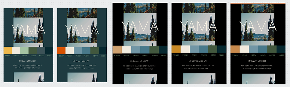
Before we stepped into the realm of Adobe XD, we wanted to get a clear understanding of Yama's brand mood. We created dozens of iterations of mood and style boards like the examples above. We decided that Yama was very much an outdoors brand. We wanted to convey that through the earthy colors. We used four analogous colors with a splash of a complimentary color.
For Yama's typography, we chose a sans serif font available to us through Adobe Fonts. This design decision was based on the fact that the font complemented the calming earth tones. With our colors, fonts, and mood figured out, we took to Adobe XD.
4/7 Higher-fidelity prototyping

With our brand styling created, we took to Adobe XD to layout the app pages. In Adobe XD, you can prototype all of the artboards to each other. This allowed us to see loose end that needed tightening up. We also learned that we needed far more pages that we initially projected.
We also found that the color schemes that we created in during our brand styling phase did not exactly fit our taste. We went back to the drawing board and came up with a new color scheme, while retaining our font and mood.
5/7 Higher-fidelity prototyping cont.

functionality
- A few things to note here: One, we finally decided to switch and reformat the XD file to fit websites. Two, you can see that we consolidated and/or deleted a few of the elements of the app in order to meet the bare minimum amount of features for a functional website-
expectation
reality
At this point in time, we have vastly decreased the gap between what we think we can build and what we can actually build. We will soon find out that this XD prototype, while comprehensive, is not capable of being fully implemented onto a no-code website like Wix. Many of the features require intermediate to advance knowledge of CSS and JavaScript, which none of the team had. Once we started to implement our design into Wix, we had to make compromises to the design.
6/7 Implementing prototype to our website

As aforementioned, our prototype was asking far more than what Wix's functionality was capable of. As we started to implement the XD file into the actual website, we noticed that much of what we wanted to add to the website wanted datasets and data-management. Although not easy, you can code these things into Wix. After some sniffing around and evaluating if it is worth doing, we decided otherwise in order to save time and effort.
Once we cut or compromised the features that were not possible for us to create, we started to play around with different versions... as you can see on the left. Through these different versions, we could test the best methods of executing the some of the features of the website and to play around with different types of style that fit the brand. We used this as a form of user testing before real guides and participants started to use the site. We tested with various types of people (age, roles, tech levels, etc.) and asked them to perform certain tasks.
7/7 Finalizing the website
We begun to onboard guides and participants to the website once the website was finished. There were a few functionality issues that needed to be resolved after users started to use the website. These quirky hiccups in the site could only be found out after real people started to use the website. This project, and business endeavor, gave me incredible insight on the amount of effort it takes to build a company, understand what functions are needed to execute the business model, style a brand, implement the functions, and meet functionality with reality.
